Digital Media Production
HTML Assignment
If I had to sum up all I’ve learned by doing this project into a singular revelation, it would be that creating something “simplistically pleasing” is trickier than one would think. Coding the HTML of the basic site was fairly straightforward. It was when I started working on the CSS elements that the project became trickier. Several times throughout the project I had to determine why a component (such as the footer) was working and why it was not. Managing the unordered list at the bottom of the homepage was particularly tricky because the header was also technically an unordered list. Any changes I wanted to make to the unordered list at the bottom would affect the top. Using a class was the solution, but that came with its own problems. I wanted to add animations individually to each link, but I also wanted the entire unordered list to shift away from the left margin. I discovered I would have to use two separate classes to get what I wanted. That represents the general trend of my process through this assignment: trial and error.
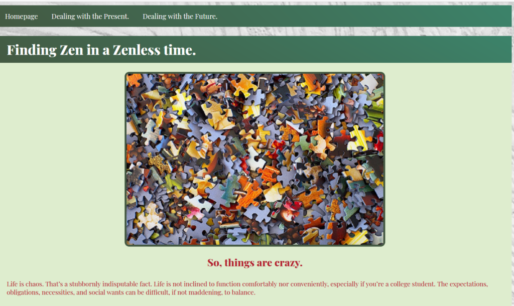
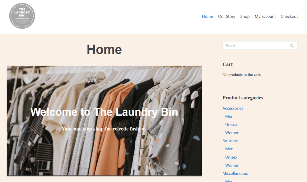
My goal in this project was to design a sight that would convey a gentle, calming atmosphere while also being easy to read. One of main challenges I faced was the problem of trying to make something simple without it becoming generic. I wanted to stick with a sensible gentle green color scheme, but I obviously had to tweak that to accommodate color blindness. I used the Adobe color wheel and Monsido’s Color Contrast checker to determine the site’s color palette. The red is a pretty strong color, but I think I kept the tone dull enough to make it work with the mood I wanted to maintain. I added a background image of a concrete wall to add some interesting variety to the page without having it be jarring or distracting (I initially tried an image of a candle-lit spa and it was way too convoluted). The body itself had a nice, greenish white tone to further add variety to the page and to make the text stand out more.
I’m pleased with how the fonts and animations turned out. I used a variety of “weights” that came with the google font “Playfair” to mark the hierarchy of text. “Playfair” matched the gentle vibe I was going for, but it had a habit of over-extending past the background color. I resorted to altering the padding to make each text fit properly into the background color box. I utilized the animation options on CSS to create smoother hover-text transitions. This in particular allowed me to make the body text more open, since it made the section items more apparent without requiring anything as intrusive as a background color to create the division.
Overall, I felt I hit the mark with my goal for this project. I do hope to learn more about animations in the future and get better with implementing them; I’d love to be able to use such animations to improve my own storytelling.
Bootstrap Assignment
Panel 1
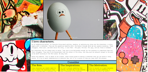
Panel one was a surprisingly difficult adventure. I learned how to implement Bootstrap, how to create custom edits to Bootstrap classes, how to design a page responsively, and how to take advantage of Bootstrap resources. Through Bootstrap I was able to add items including a navbar, a carousel, and functional buttons. Through Bootstrap I was also able to organize the page into a comic-panel format which I think really came together nicely.
Probably the most difficult part of this project was keeping the aesthetic together. Google Chrome’s inspect tool was a godsend. I used it religiously to understand what Bootstrap was doing that I needed to adjust. The bottom row of panels, for example, needed to be adjusted so they would match the top. I needed to adjust the text to avoid it becoming overwhelming, to adjust the button so it wouldn’t sit on the line, the width of the carousel images so they wouldn’t take too much of the screen, the proportions of the images to avoid the page suddenly bouncing with each new image. I also had to make sure everything responded appropriately when the screen was mobile sized. It was a lot of trial and error and adjustment. I’m proud of how it turned out.
Panel 2
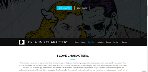
After testing two other themes, I decided to go with the “Imperial Theme” from BootstrapMade. Although some omission and reorganization was necessary in order to better fit my theme (and to avoid editing CSS), the basic design worked well for an advice based website. An “about” section was offered before the panels, which allowed me to explain the website before I delved into the tips. The former “portfolio” section lent itself to a neat character inspiration exercise. The “subscribe” section easily converted to a link to reference website, and I was able to transform the testimonials into a “quote” section. Most importantly, it has more than 68,000 downloads on a trusted website (which features its latest update as 2020) and it’s easy to customize for Panel 3.
Panel 3
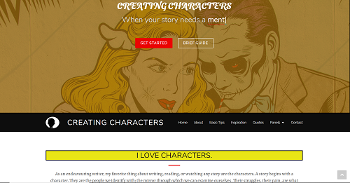
The goal for this panel was to combine the aesthetics of the first and second panel. Google Chrome’s “inspect” element was key to determining how the CSS of the Bootstrap theme functioned. I was able to replace the colors and fonts of the initial theme, as well as establish a comic-book feel from the first panel through the using of bordering on several sections. The fonts were selected as a duo pairing, which helped create a better distinction between sections. The colors of the panels required some experimentation to avoid them becoming too jarring, too clashing, or from overwhelming the color of the font within them.
One of the greatest challenges I faced during this assignment was my unfamiliarity with the theme. I found I had to take my time to learn it and said learning often came with struggle. I think one of the principle things I learned from this assignment was the importance of understanding how code reads from the top down, as I found that the placement of my style-sheet could create serious problems in the long run if done incorrectly.
The elements I am most proud of in this are the animations. I was able to take the lessons I learned from the first project and integrate them into the quotes and the title. The title features a set of keyframes that alternate between different fonts, which I felt was a fitting aesthetic choice for the subject matter of this website. I also added an animated “hover” element to the quote section, in order to give those quotes an extra pop.
Overall, I think I was able to utilize the CSS to create the “pop-art” look I was going for. I still would like to improve my animation skills via CSS, and I hope to be able to more easily make sense of complex HTML and CSS sheets in the future.
Project 3
Commerce
The commerce portion of the project was admittedly the harder one of the two for me. WooCommerce is an incredibly useful platform and it instantly gave me a shop to work with. The challenge came with creating an aesthetic around WooCommerce. I used the theme ‘Neve’ since it supported WooCommerce and because it was a very simple very malleable structure to work with. For the aesthetic I created a custom logo using Canva.com. I used CSS primarily for the typography. The front page needed special attention because the intro text would be lost in the background of the image I chose, so I had to change the colors specifically for that. I also had to alter the padding for the ‘Welcome Back’ block (which won’t appear until a second visit to the website).
I added a few additional plug-ins in order to make it easier for my hypothetical business to function. I added “Pop-Up Builder” to feature a newsletter pop-up when someone visits my website. I also added ‘Contact Form 7’ to add a contact form at the bottom of my home page, and I added ‘Customer Reviews’ so I could have a star-rating feature for each product. Through these additions, I felt I was able to create an appealing and viable store. In the future, however, I would like to dive deeper into what WooCommerce could offer me.
News
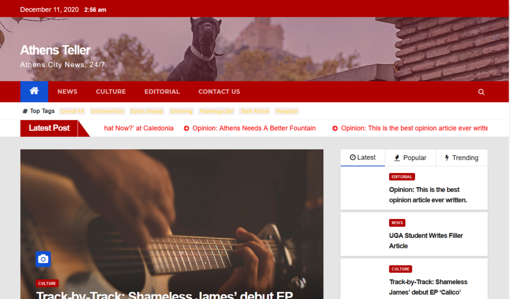
I was way more in my element for the news site. I used the theme “Newsup” because it lent itself well for the news format and offered several neat innate plug ins, such as a scrolling headline bar and a ‘trending’ tab. For this project I added “Visualizer: Tables and Charts” to add an interactive pie chart for one of my articles, “Custom Twitter Feeds” in order to add a breaking news feed (I had to use CNN’s feed as a stand-in), and “Contact Form 7” to create a contact page. The most difficult part of this project was the CSS. The theme customizer only offered so many options, so I had to go and change the coloring and type through CSS modification.
One of the more frustrating aspects were the ‘featured images. They would always appear at the top of a page, so if I added an image as a block, two of the same image would appear on the page. Since featured images would appear both on the home and on the posts page, the featured image had to stay. I had to adjust accordingly, and I will admit that it’s my primary gripe about the theme. In the future, I would like to learn more about plug-ins and see what else I could add on to the overall site.
Javascript Project
Portfolio Website
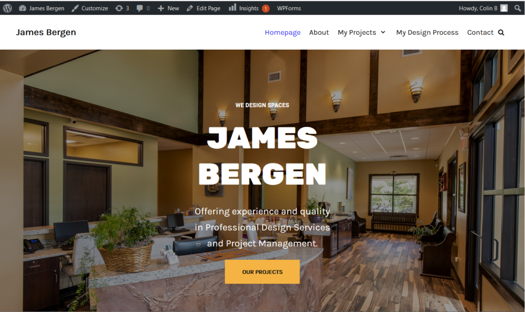
For this project, I decided to create a portfolio website for my dad. He’s involved in professional design services and project management – essentially, he drafts building designs and works with construction to make sure that building is as close to the client’s vision as possible.
My process began, naturally, with discussing what he wanted out of the website. We determined that it would need to be something that showed off the best and most recent of his work in order to provide the best representation of him. We agreed that the best way to show off that work was to highlight a choice few and show the various stages of work that went into it, since he’s involved in just about every phase of the construction process.
My dad didn’t have a vision as to what the design of the website would look like, so I had to gauge what the best look was based on what I knew about him and how he responded to the images I sent him. A sleek, minimalistic look turned out to be the right approach. The “neve” WordPress theme allowed me to do just that, as well as utilize a range of ‘section’ blocks to mirror the portfolio items featured on Bootstrap themes; however, a few plug-ins did to be added to add more ‘pop’ to the site. The “counter numbers” feature allowed me to emphasize the sheer quantity of work he has done with scrolling numbers. WPForms Lite allowed me to set up contact forms to put on a separate contact page and on the bottom of the page. As for other aesthetics, I changed around the font to a combination of Rubik and Karla for a sleek but not too corporate look, and I kept the color scheme to a simple set of five highly distinct, but not clashing colors.
This project had more backend work than the others I’ve done. I knew Google Analytics would be useful to my dad since it would what kind of traffic he was getting, what pages were being viewed the most and longest, and what devices were being used to view his portfolio. All of this could give us hints as to what was working and what was not. I implemented google analytics via the “Google Analytics for WordPress by MonsterInsights” plug-in, which provided him with a very handy page on the site for him to see the data in action.
It was my idea to add the 3-D models to the website, in order to fully show off what my dad does at his job. Uploading these models was easier said than done. I initially tried to upload them via the Vrm360 Plugin, but due to the limitations of his software and the fact the file types we needed could only be exported through an upgraded subscription, I had to discover a workaround. The SketchUp website offered a way where we could embed the models into the website. We simply had to upload the concept models he made into the website, and then once published, re-paste the embed code onto the WordPress site. This ended up working out; however, the model viewers were misaligned. I could not manipulate the padding without altering the resolution of the viewer, so I opted for adjusting the margins instead. I also had to utilize media-queries to prevent the mobile version from looking strange.
The written content of the site was a combination of information he sent me and my own creative spin. The “about” page was essentially his resume but arranged in a more visually appealing manner. The rest came from a range of promotional material and his own descriptions.
This was definitely my greatest undertaking in this class. While it involved skills I had grown used to, it was still an undertaking that had new ground for me. I had never worked with a client before, and it was exciting to be able to make something that would be useful to someone else. It could be tricky at times since I couldn’t just conjure information like I did in the previous projects; I had to adapt the information I had into a complete product. I had to figure out how to best represent a field that I wasn’t deeply familiar with in a manner that demonstrate that my father was an expert in these things. I feel satisfied that I was able to get that across. Google Analytics was a bit of a strange process for me to set up, but it proved mostly painless. The models were definitely a pain; I spent several hours across the project timeline trying to figure out what I could do to implement them. I’m glad that now everything has worked out, and I hope to create more satisfying projects like this in the future.